If you’re having trouble reading text on your Windows computer’s display, or you can see it reasonably well, but your eyes tire quickly, then you can use the ClearType Text Tuner to improve the readability of the text shown on your screen. The ClearType Text Tuner can be used to turn on ClearType or turn it off, a technology developed by Microsoft to increase the readability of text on modern displays like the one on your laptop. Here’s what ClearType is, what it does, and how to turn it on or off in Windows 10 and Windows 11:
What is ClearType?
ClearType is a software technology developed by Microsoft to improve text readability on modern screens such as your Windows laptop’s display. It tries to reduce visible artifacts when text is rendered on the screen and make text appear smoother and less jagged. To achieve its goal, ClearType sacrifices the color accuracy of the image displayed on the screen for enhanced light and dark luminance when displaying text. However, this compromise leads to an improved text appearance on computer displays.
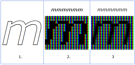
The letter m without ClearType (2) and with ClearType (3)
Image Source: Microsoft
ClearType was first implemented in 2000 in a free app named Microsoft Reader, which was designed for reading ebooks and was initially available for Windows 95 computers. Microsoft tweaked this technology over the following years and made it available as part of Windows, Microsoft Office, Microsoft Edge, and many other products. Today, if you enable ClearType in Windows, your settings are automatically applied to all the apps that support this technology.
If you want a bit of history about ClearType and how this technology works, I recommend this article on Microsoft’s Learn platform: Microsoft ClearType overview.
Should ClearType be On or Off?
To answer this question, simply look at the picture below. First, you see how the same text is rendered with ClearType turned on and then turned off.
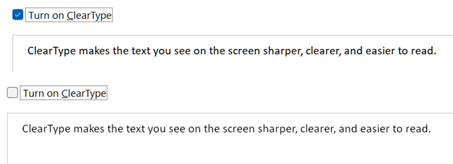
ClearType on vs off
It’s visible that ClearType does make the text sharper and easier to read. Turning it on is a good idea if you spend a lot of time working on your computer, reading text frequently, and you want your eyes to have an easier time reading what’s on your screen. It is especially helpful to people who wear glasses like me, as my eyes tire less easily.
However, if you are a graphic designer or do some work in which color accuracy is paramount, you don’t want ClearType turned on, and it is better to have it turned off. In this guide, I share instructions on how to do both things, so continue reading.
How to open the ClearType Text Tuner in Windows 10 and Windows 11
Turning ClearType on and off is done using the ClearType Text Tuner. To open it, in Windows 10, click or tap inside the search box on the taskbar, type cleartype, and open the Adjust ClearType text search result.
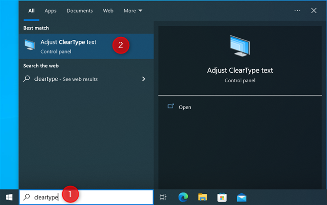
In Windows 10, search for cleartype
In Windows 11, the steps involved are the same: click or tap the Search icon inside the Search box on the taskbar, type cleartype, and click or tap Adjust ClearType text.
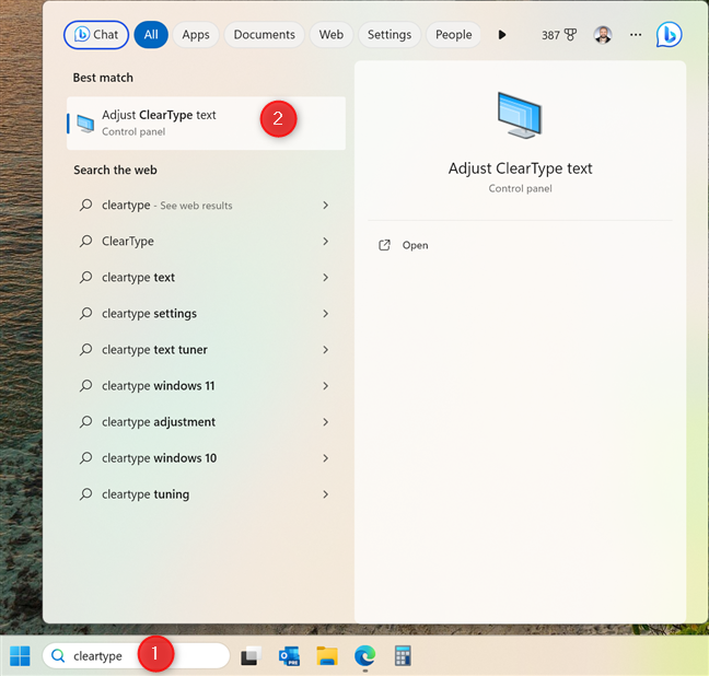
In Windows 11, search for cleartype
TIP: If you want to fine-tune the colors displayed by your PC display, here’s how to install its color profile in Windows.
How to turn on ClearType in Windows 10 and Windows 11
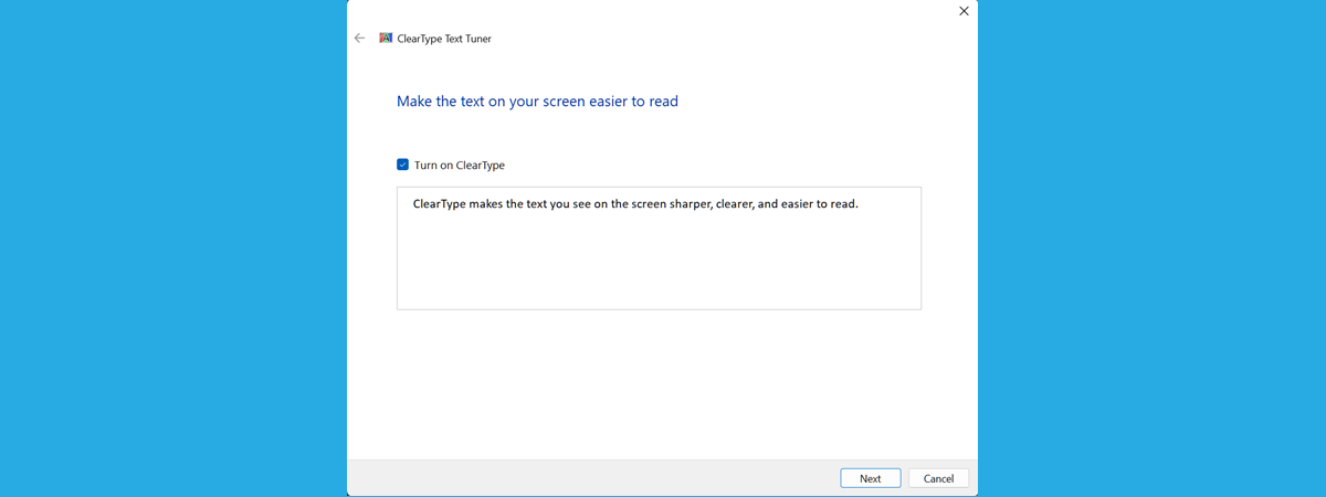
The ClearType Text Tuner wizard looks and works the same in Windows 10 and Windows 11. When you start it, you see a checkbox to Turn on ClearType, and you are informed that ClearType makes the text you see on the screen sharper, clearer, and easier to read. Check the Turn on ClearType box and press Next to enable this feature.
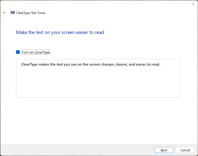
Turn on ClearType and press Next
Your monitor is shown, and Windows checks whether it is set to its native resolution. If it isn’t set to its maximum native resolution, the wizard gives you two options: change to the monitor’s native resolution or keep the current resolution. If the native resolution is already selected, there’s no choice for you to make.
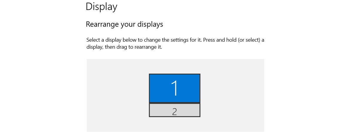
If you use two or more monitors, you are shown all connected monitors, and you are asked to choose whether you want to tune all monitors now or only the one you select. Then, Windows checks if the selected monitor is using its native resolution. When you’re done making your choices (if any), press Next.
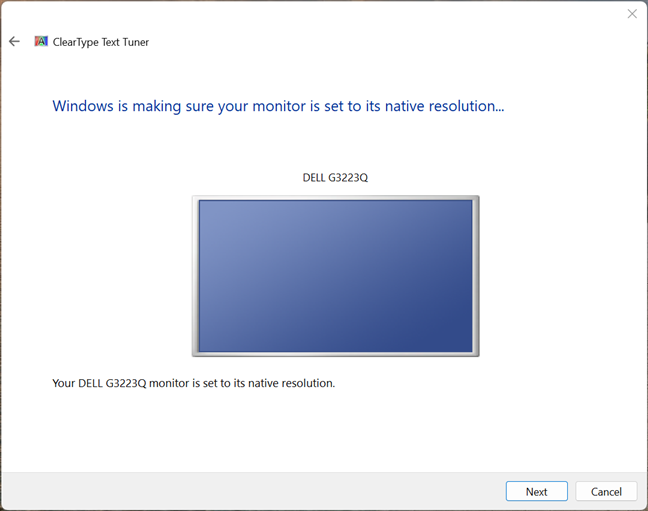
The monitor you are about to configure
TIP: Here’s how to check the screen resolution in Windows.
You are then shown five screens with different text samples. For each sample, the ClearType Text Tuner uses different settings. On this first screen, you get only two text samples. Take a careful look at them and select the text sample that looks crisper and clearer. Then, press Next.
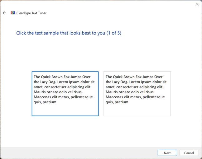
Sample 1: Choose the one that looks best to you
The second text samples are shown. This time, it is five of them. Again, try to read them all, see which one looks crisper and more comfortable for your eyes, select it, and click or tap Next.
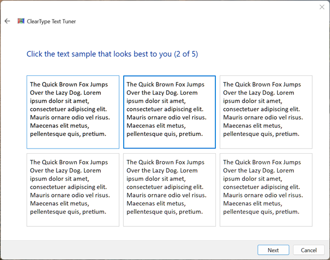
Sample 2: Choose the one that looks best to you
The third set includes three different text samples. Select the one you prefer and press Next.
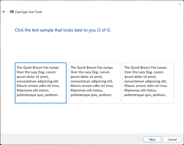
Sample 3: Choose the one that looks best to you
The fourth set includes six text samples. Repeat what you did before and click or tap Next.
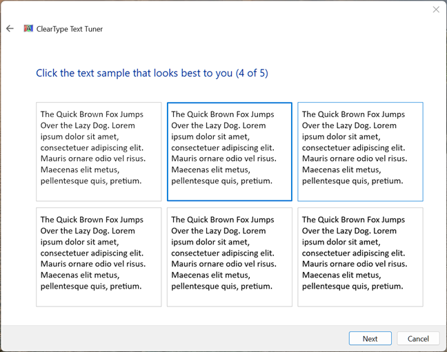
Sample 4: Choose the one that looks best to you
You’re on the final set of samples, six of them. Select the one that looks best for you and is easier to read and press Next one last time.
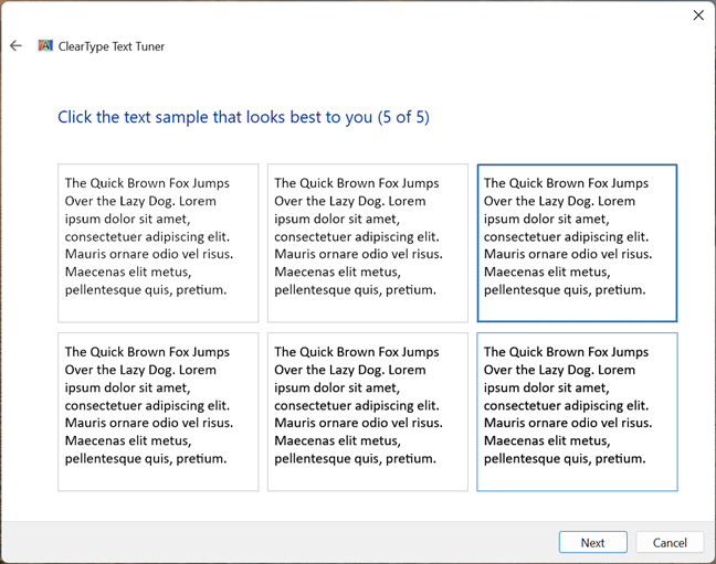
Sample 5: Choose the one that looks best to you
You are informed that you have finished tuning the text on your monitor. You are shown its name and a green checkmark, signaling you are done. Press Finish, and you are done.
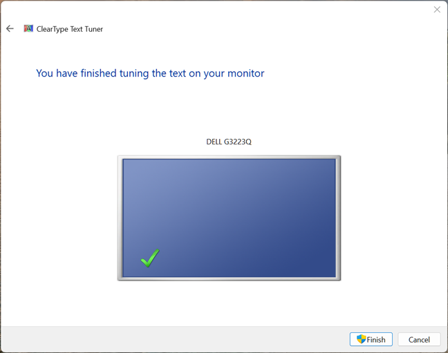
Press Finish to close the ClearType Text Tuner
NOTE: If you have a computer with multiple monitors and select that you want to fine-tune all of them, the wizard will guide you through the same steps for all your other displays.
How to turn off ClearType in Windows 10 or Windows 11
If you want to turn off ClearType, open the ClearType Text Tuner using the instructions shared earlier in this guide. When you see the ClearType Text Tuner wizard, uncheck the “Turn on ClearType” box and press Next.
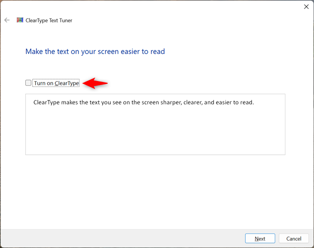
Disabling ClearType
Then, follow the same steps in the wizard as in the previous section. You will fine-tune how text looks on the screen WITHOUT ClearType turned on.
TIP: If you want ClearType turned off but need to improve the readability of text on your screen, you can also change the screen resolution using these guides:
Did you turn ClearType On or Off?
As you have seen, using the ClearType Text Tuner is easy, no matter whether you choose to turn ClearType on or off. Now that you know more about the purpose of this tool and the technology behind it, I’m curious what you noticed: Did ClearType improve the readability of text in a meaningful way? Did you choose to enable it? Or did you turn it off? Comment below, and share your perspective.


 20.09.2023